Minor Commerce Manager: You may have products with multiple templates, with each template having multiple attributes. A new Hide Empty Fields toggle allows you to only see the fields that have values set.
Elastic Path Changelog
Keep up with changes to Elastic Path services by subscribing to our RSS Feed, Atom Feed, or JSON FeedStudio Release 147 | August 10, 2022
Overview
With this release we added new trial functionality for Shopify users who add the app to their store. We also shipped a new editor header as well as an in-app help panel.
Banner Features
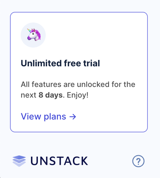
Unlimited Free Trials
As of today, new accounts through Shopify will start on a free trial plan that will last 14 days. Users on the free trial have access to all Unstack Landing page features. At the end of the trial, users are forced to choose a plan even if it means that they choose the Free plan in order to continue using Unstack.
New Editor Header & Publish Button
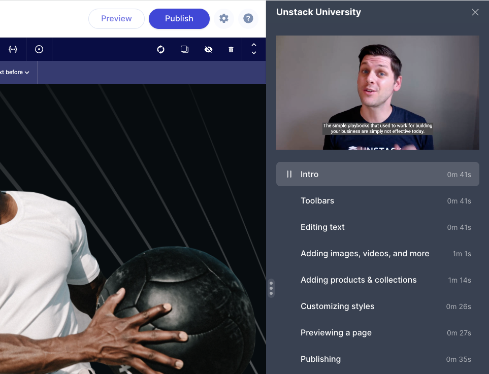
With this release we also add a new header for our page editor. This includes new preview & publish buttons. The new header makes the publish button more prominent removing the need for a second publish button. The hope is that the prominence will help improve publish rates.

Unstack University Help Panel
Along with the above-mentioned header changes we also shipped a new help panel for Unstack. This panel includes the chat widget that connects users to our Support team and also contains many help videos for getting started with the tool. Expect some more updates on this panel in the coming weeks.
Complete List of Resolved Items
Shopify Onboarding
- Feature - Added unlimited free-trial functionality for all Shopify plans. Also migrated any account that was
created before this release to the new trial plans.
- Feature - Added support for showing snapshots of any "drafts" a user might have created in Shopify's embedded app.
- Feature - New header for the page editor!
- Feature - New help panel within the page editor!
Reviews Component
- Bug - Fixed an issue where the color selector wasn't respecting the default value defined in the property.
- Bug - Fixed an issue where the selection made in the color selector wasn't respected in the rendered page.
Product Collection Component
- Bug - Fixed an issue where products in the collection component would sometimes "blink".
- Bug - Fixed an issue with the product collections component where the images would sometimes randomly change.
- Feature - Added a "show alt image" hover state to the product collection component.
Smart Links
- Tweak - Added smart-link support for any PDFs that have been uploaded to Unstack. You can now search for these
just as you would a page or product.
- Bug - Fixed an issue where products linked in an account's header or footer wouldn't open product selection modal.
Other Components
- Bug - Fixed an issue where the "Blog / Article Test + Images" component was using paragraph styles for the
article titles.
- Bug - Fixed a couple collisions where the new editing header wasn't appearing properly in Blog Layout or the Article Editor.
- Bug - Fixed an issue where a change to Blog Layout couldn't be changed.
- Bug - Fixed an issue where the text alignment options in a box wouldn't overwrite the text alignment options set at the text level.
- Tweak - In the Section/Component Editor, we're now mandating that elements be included in a
<section>tag. Now when you try to add an element outside of the<section>tag you'll be shown an error.
Other Changes
- Bug - Fixed an issue where "location" was missing from captured form values.
- Bug - Fixed an issue where custom form fields were not being displayed in customer entry.
- Bug - Fixed an issue where "Author" and "Tag" page views were not being recorded.
- Bug - Fixed a bug where accounts could get in a state that would return a 404 error when visiting /blog.
- Bug - Fixed an issue where certain images with their image-optimization settings would render as PNGs despite having the image-optimization setting set to "Resize/Next-gen Optimize"
- Bug - Fixed an issue with the Media/Text + Stacked (Mobile App) component had it's text cut off on mobile.
- Tweak - Adjusted the algorithm for optimizing images to use WebP for graphic images.
Changelog 2022-08-03
Minor A new external_ref attribute allows you to store another unique ID with your PXM product. This could be a unique ID from another company system, for example. See Create a product.
Changelog 2022-08-02
Major payflow_express and paypal_express endpoints are no longer supported. We recommend to use PayPal Express Checkout gateway. For more information, see Configure PayPal Express Checkout and PayPal Express Checkout Payments.
Changelog 2022-07-26
Minor You can now forward some additional parameters to your Identity Provider via the authorization endpoint. For more information, see Single sign-on with OpenID Connect.
Studio Release 146 | July 26, 2022
Overview
This release bookends a lot of the improvements in Release 143, Release 144, and Release 145 with some finishing work and a number of bug fixes. The most significant feature added is the ability to customize shadows in the style guide.
Banner Features
Shadow settings in the style guide
Full shadow customization is now available through the Style Guide!
Out-of-stock products
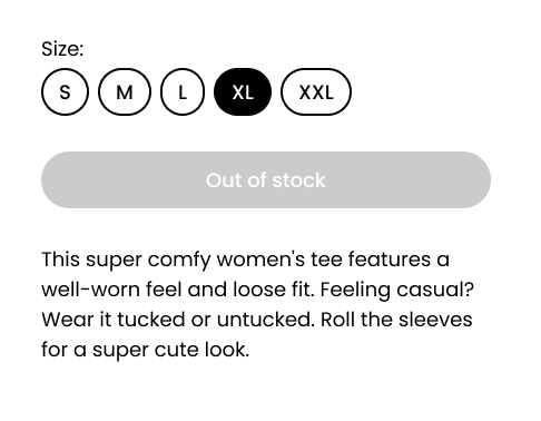
The product component will now display “Out of Stock” on the add-to-cart button in addition to disabling it when the number of available products is less than 0.
Smart Link Polish
Some additional work was done on smart links to expand on current tooling and to squash some persistent issues with toolbar functionality.
Complete List of Resolved Items
Shopify
- Bug - Fixed an issue where navigation links in the liquid header/footer would appear differently in Unstack than they did in Shopify.
Editor Improvements
- Feature - Added support for pre-defined shadow settings in the Style Guide.
- Feature - Added NoML support for defining default shadows on components.
- Tweak - Adjusted box toolbars so they don't float over content when expanded.
- Bug - Fixed an issue where the default box shadow setting was not properly indicated in the box toolbar.
- Bug - Fixed an issue where the A/B Testing button would require two clicks to open sub-toolbar.
Smart links
- Tweak - Pushed several more stability updates for Smart Links
Components
- Tweak - Adjusted the text of the product component's Add-To-Cart button to say "Out of stock" when the product
is out of stock.
- Bug - Fixed an issue with the banner component where an applied background image wouldn't be displayed.
- Bug - Fixed an issue with the background color of the banner component not rendering properly
Style Guide Improvements
- Bug - Fixed an issue where the color selection drawer would show the color in RGB.
- Bug - Fixed an issue where Brand Primary was being set to "rgba (0,0,0,0)" by default.
Klaviyo
- Tweak - Refreshed client-side properties that are pushed to Klaviyo.
- Tweak - Cleaned up contact info in our database.
- Bug - Fixed a CSS collision issue with Klaviyo popover forms.
Customer Issues
- Bug - Fixed an issue where a user couldn't open their Style Guide
- Bug - Updated FAQ schema
- Bug - Fixed a product images issue
- Bug - Updated URL & OG URL definitions for author pages
Changelog 2022-07-21
Major You can now add exclude options under the schema object to exclude nodes and product SKUs for the following promotion types:
- Create a Cart Fixed Discount Promotion
- Create a Cart Percent Discount Promotion
- Create Fixed Discount Promotion for items
- Create Item Percent Discount Promotions
Major You can now define target_nodes under the schema object to include nodes for the promotion for Create Fixed Discount Promotion for items and Create Item Percent Discount Promotions.
Major Added endpoints that allow to read and write Time-to-live (TTL) settings for logs. For more information, see Logs Time-to-live (TTL) Settings.
Changelog 2022-07-19
Major You can now see the differences between the latest 2 catalog releases. See Publish a catalog.
Minor You can now get multiple stocks using implicit token. For more information, see Get Multiple Stocks.
Studio Release 145 | July 17, 2022
Overview
This was a huge release for us and broke (again!) the record for most number of shipped items in a release (previously held by Release 143. Highlights include improvements to Shopify product syncing, updated callouts components, and better handling of bad components in the editor. Also, a ton of bug fixes.
Banner Features
Better Shopify Sync
In this release, we’ve added support for Shopify webhooks which should remove the delay between making changes to products and sync. Webhooks allow Unstack to receive notifications from Shopify when products change and update the product immediately.
We also introduced an improvement to syncing media on the initial sync so that media will be synced as needed rather than delaying the initial sync. Importing media takes a lot of time, so doing this as needed should make the initial sync go faster.
Updated Callouts component
Following the changes we made to the media component in a previous release, the callouts component has also been updated to follow similar conventions.
All in all 7 components have been combined into two callouts components: icons and images. The new components allow you to adjust the number of columns on desktop and have styles for Cards and 3D Cards. Image cropping and icon size are also adjustable.
Deprecating older components
With the recent work on the media and callouts components, we can now deprecate 11 components that are no longer needed. All of the functionality in these components is available in our new updated components.
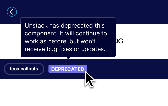
Going forward any component that has been deprecated will have a "Deprecated" badge in the editor and they will not show up as components that you can add to pages. This will ensure that sites continue to operate as expected, while also ensuring that new users aren’t overwhelmed by too many versions of the same component.
Better error handling for bad components
We've made improvements to the instances where poorly-implemented components crash. Now you'll see error messages for individual components when they fail to render in the editor and you can now delete them if you want to start over.
The aim here was to make it easier to identify and repair pages where components fail to render. Previously, the entire editor might crash when issues like these arose.
Complete List of Resolved Items
Product Component
- Tweak - Made a change to our backend logic when auto-resizing images.
- Bug - Fixed an issue where product images would sometimes be missing.
- Tweak - Made a change to our backend logic when auto-resizing images.
Product Collections
- Bug - Fixed an issue where the product collection drawer would load infinitely without returning results.
Editor Improvements
- Feature - Updated the editor so components that have crashed can always be removed within the editor.
- Feature - Updated error messaging when there are issues loading components in the editor.
- Feature - Implemented "Section-level" error boundaries to prevent the entire app from crashing when a component in the editor returns an error.
- Tweak - Adjusted the component list to no longer show deprecated components.
- Tweak - Pushed several updates for Smart Links.
- Bug - Fixed an issue where resizing a a browser window while working in the component editor would cause a crash in the app.
- Bug - Fixed an issue where item-preview pageview and form endpoint would return an "Item not found" error.
- Bug - Fixed an issue where the image placeholder in the "Box" component would return an error if certain layout options were selected.
- Feature - Updated the editor so components that have crashed can always be removed within the editor.
Style Guide Improvements
- Bug - Fixed an issue where large heading options would wrap to a second line in the text toolbar.
- Bug - Fixed an issue where the margin that headings had in the editor didn't match the rendered version of the headings.
- Bug - Fixed an issue where headings had a margin applied to them within the text toolbar.
- Bug - Fixed an issue where hex codes added without "#" wouldn't render correctly.
- Bug - Fixed an issue for a user who was unable to open their Style Guide.
- Bug - Fixed a spelling issue for the word "Vertical" in Style Guide > Forms > Spacing.
- Bug - Fixed an issue where large heading options would wrap to a second line in the text toolbar.
Smart Links
- Bug - Fixed an issue where Shopify users were able to find "Home Page" through the smart link toolbar.
Shopify
- Feature - Added support for screenshotting draft pages for use in page thumbnails.
- Feature - Updated sync job with webhooks to automatically detect changes to products and sync them accordingly.
- Feature - Improved media object syncing for Shopify objects.
- Tweak - Made changes to plan selection screen.
- Tweak - Updated sync job so that it no longer tries to sync inactive stores.
- Tweak - With the changes we've made to our sync jobs, we updated the text of embedded app to no longer mention an every 30 minute sync.
- Bug - Fixed an issue where the arrows for scrolling through landing page templates were not available.
- Feature - Added support for screenshotting draft pages for use in page thumbnails.
Data Driven Content
- Bug - Fixed an issue where the row options would be pushed out of view if the page slug was too long.
Components
- Feature - Added NoML support for custom properties on boxes.
- Feature - Added NoML support for custom properties on any element.
- Feature - Launched deprecation tooling for retiring older versions of standard components.
- Feature - Released new image callouts component
- Feature - Released new icon callouts component
- Feature - Deprecated old image callouts components
- Feature - Deprecated old icon callouts components
- Bug - Fixed an issue where FAQ components would break if a product component was also on the same page.
- Bug - Fixed an issue where the "Media/Text + Callouts" alignment wasn't working.
- Bug - Fixed an issue where some media boxes were missing their toolbar.
- Bug - Fixed an issue with embedded Vimeo videos.
- Bug - Fixed an issue where background images would appear differently in the editor than they did on the rendered page.
- Bug - Fixed an issue with the "Pricing/Table" component when used on a dark background
- Bug - Fixed an issue with the margin of the "Quotes" component.
- Bug - Fixed an issue with missing padding on the "Media/Text 8:4" component.
- Bug - Fixed a missing icon issue when the "Media/Text + Quote" section was loaded on a mobile device.
- Feature - Added NoML support for custom properties on boxes.
Customers/Contacts
- Bug - Fixed an issue with the customer list where creation dates were being ordered incorrectly.
Other
- Bug - Fixed an issue where Shopify 404 pages would show a random brands logo.
- Bug - Fixed an issue where DNS settings would not display properly.
- Bug - Fixed an issue where cloning a page would result in a 500 error.
- Bug - Fixed an issue where Shopify 404 pages would show a random brands logo.
Changelog 2022-07-13
Major Split Payments (Beta Release) are now available. For more information, see:
Major You can now add amount and paymentmethod_meta as optional fields for the payment methods. See Manual Payments.
Major You can now include or exclude variation options when building your child products. See Build child products.
Changelog 2022-07-11
Major A new custom_inputs attribute allows you to add personalized or custom text to a product that can be displayed in your storefront. For more information, see create a product.
Major A new custom_inputs attribute allows your shoppers to add personalized text to products when adding items to a cart. For more information, see Carts.
Changelog 2022-07-06
Major A new product import API is available that allows you to manage and upload your product data. For more information, see Import PXM Products.
Major Commerce Manager: You can now manage and upload your product data from Commerce Manager. For more information, see Importing Products.
Studio Release 144 | July 4, 2022
Changelog 2022-06-29
Major Integration events for newly created integrations are now processed concurrently. See Integrations.
Changelog 2022-06-27
Major You can now use the erasure requests functionality to automatically erase personal data. For more information, see How to erase Personal Data.
Studio Release 143 | June 23, 2022
Overview
Release 143, was one of (if not the) biggest releases we've ever done. With this release a number of banner features went out as well as more than two-dozen bug fixes.
Banner Features
Better Media Component
With this release, we pushed out a new version of our Media/Text component that allows for much more control over its appearance and behavior.
Spacing/Width Defaults (Desktop & Mobile)
We’re on a quest to enable sites of any width. In this release, we’ve introduced settings in the style guide that allow you to adjust the default width of sections. As a bonus, we’ve also introduced the ability to configure default padding on desktop and mobile.
Box Shadows
With this release you're now able to add shadows to any box.
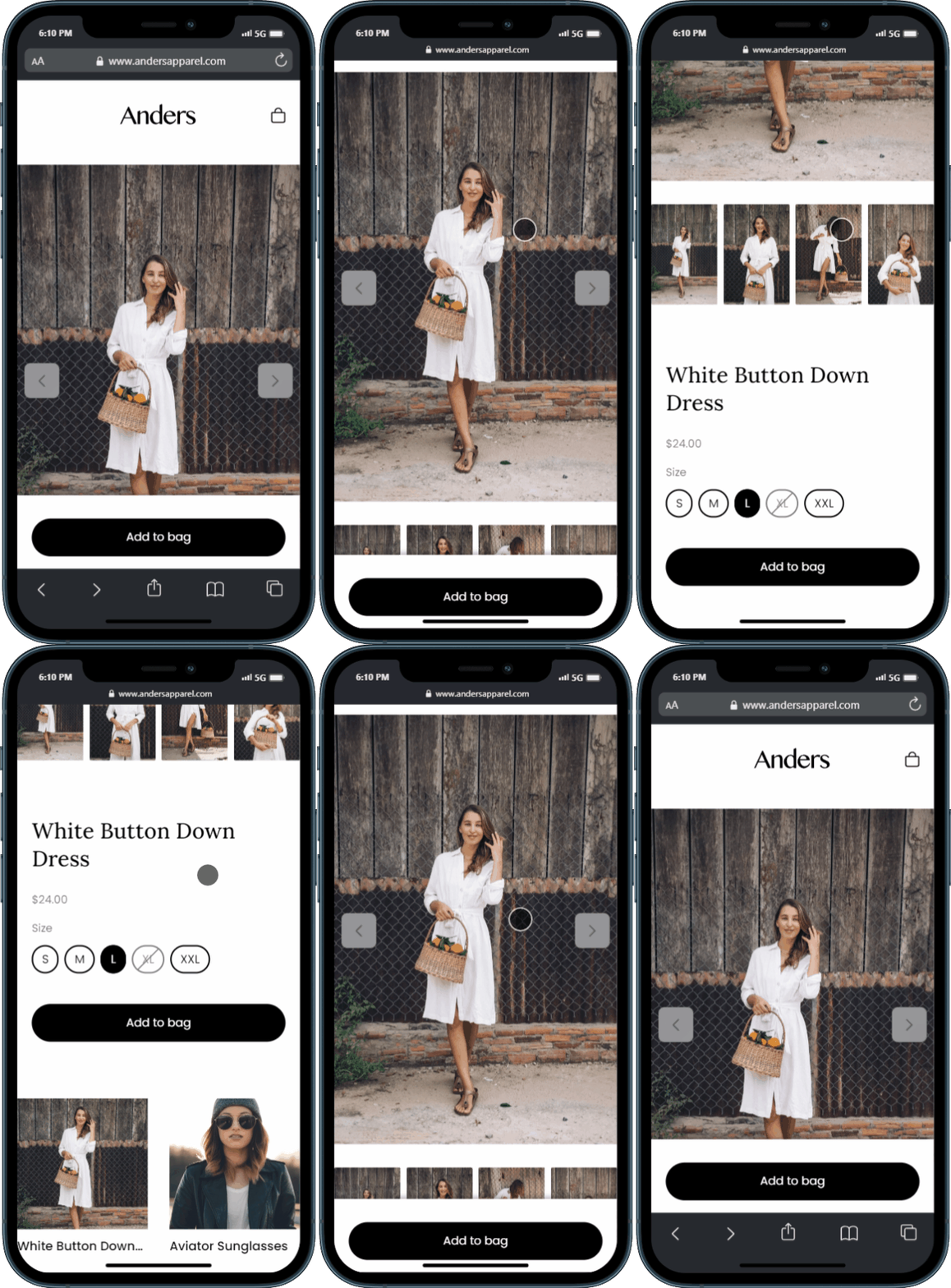
Sticky Buy Button
When a page with a product component on it is viewed on mobile, an "Add to Cart" button will now follow the user as they scroll down the page.
Triple Whale Integration
For all our Triple Whale users out there, we've update our official integration to include support for add-to-cart event tracking!
PostScript Integration
We've also launched an official PostScript integration!
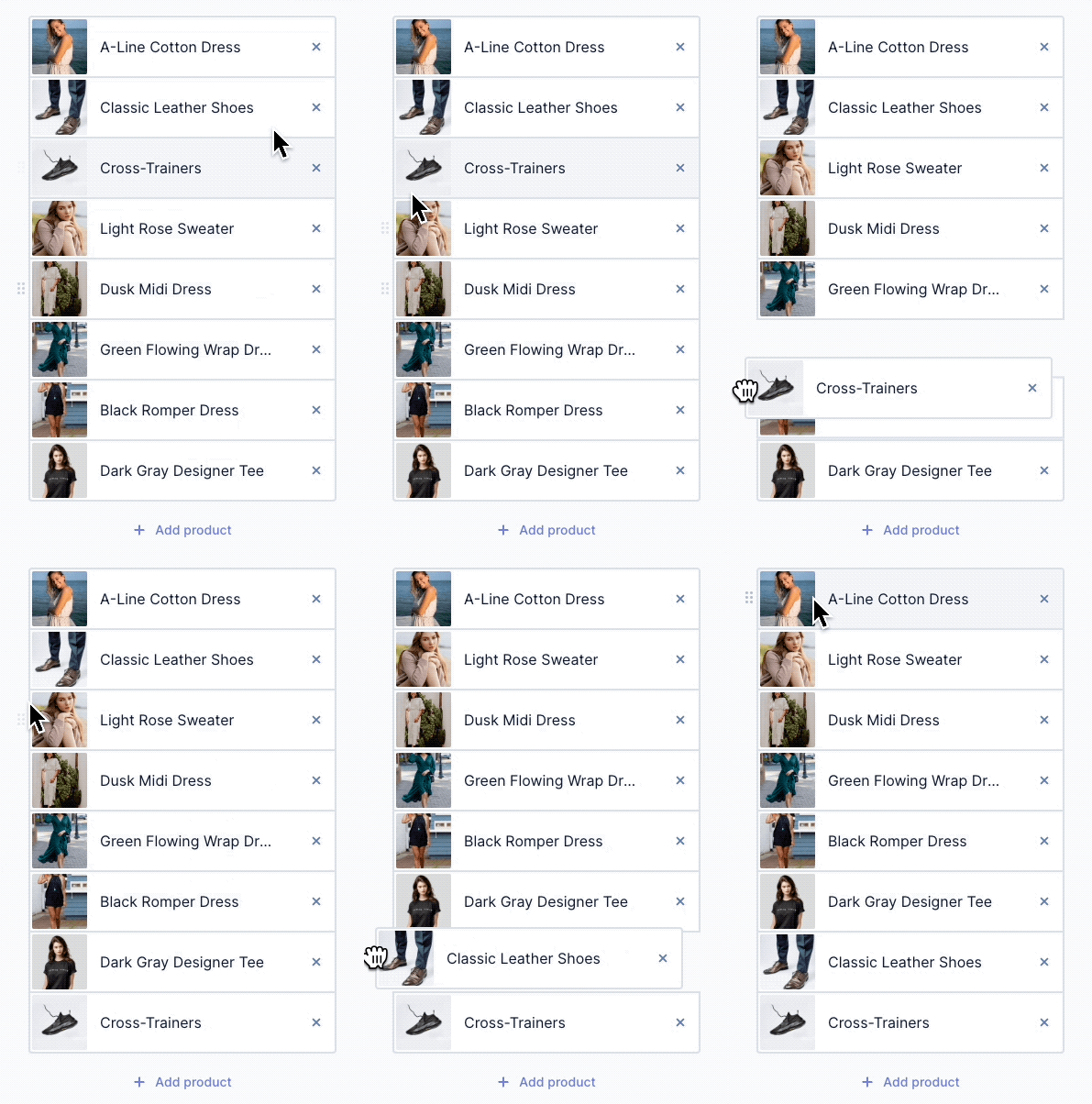
Product Collection Drag & Drop
With Release 143, products in a collection are now drag-and-droppable! The hope here is to make it easier to rearrange items displayed in a collection.
Recently**Used Components**
Another change that everyone will love; there's now a component category for Recently Used that shows the last ten components you've used.
Immediate sync of 5 most recent products
We changed the way that our sync job works so that as soon as you connect Unstack to your Shopify store for the first time, the five most-recently-updated products will be synced from your account. The aim here is to help more people start building more quickly and to make it a more seamless experience the first time someone loads their Unstack account.
Complete List of Resolved Items
Better product component
- Feature - Sticky buy button for mobile
- Bug - Fixed an issue where product component images weren't loading properly on liquid header/footer sites.
- Bug - Fixed an issue with gallery interactions when full-screened.
- Bug - Fixed an issue where selecting one variant option would activate the add-to-cart button.
Better product collection components
- Feature - When a header is added to the product collection component, the actions are now located to the right.
- Feature - Drag and drop now supported for editing product order in collections
- Bug - Fixed an issue where price wouldn't show up properly in the editor for products added to a collection component.
- Bug - Fixed an issue where hitting "enter" when searching for products in the collection component would reload the page.
- Bug - Fixed an issue where the header of a product collection component wasn't editable.
Product & Collection Smart Links
- Tweak - Removed backwards compatibility for link behavior key
- Bug - Fixed an issue where multiple toolbars would appear when hovering over text in the box component.
- Bug - Fixed an issue where header and footer smartlinks to products wouldn't properly open if set to popup.
- Bug - Fixed an issue where marking a product as a "draft" in Shopify would break any smart-linked buttons in the editor.
Editor Improvements
- Feature - Added support for shadow settings on the box toolbar
- Feature - Added "Recently Used" component category as the default for component selection.
- Tweak - Made a change to the clickable area for toolbar dropdowns to make it easier to interact with the options.
- Tweak - Made a change to the paint can icon so that it now properly indicates when an option is selected.
Style Guide Improvements
- Feature - Added Style Guide support for width and padding defaults on both desktop & mobile.
- Tweak - Made several improvements to the initial styles scrape that takes place when you first connect Unstack to Shopify.
- Bug - Fixed an issue where adding a new heading wouldn't inherit the configuration of the most recently configured heading.
- Bug - Fixed an issue where the text "Light Background Color" was being cut off in the Style Guide.
- Bug - Fixed and issue where the styles-scrape job would sometimes fail to grab a Brand Primary
Components
- Feature - Added new version of the media/text component.
- Bug - Fixed a bug where certain components were returning "Unable to load component" errors.
- Bug - Fixed a bug where errors would appear when a Vimeo video was embedded on a page.
- Bug - Fixed an issue where rich text would run outside of "Box/Variable" component.
- Bug - Fixed an issue where the hover effect of a button would appear incorrectly on dark-themed components.
Shopify Syncing
- Tweak - Adjusted our initial product sync to first sync the five most recent products before continuing the job.
- Bug - Fixed an issue where some products would pull in multiple versions of the same variant.
- Bug - Fixed an issue where the initial sync would very rarely get stuck and would prevent future sync jobs from working properly.
Integrations
- Feature - Added a PostScript integration.
- Tweak - Adjusted our Triple Whale integration so that it fires add-to-cart events.
Templates
- Bug - Fixed an issue where some template thumbnails were not correctly generating due to animations on the pages.
Storefront
- Bug - Fixed an issue where certain storefront collection templates were returning 500 errors.
Media
- Bug - Fixed issue with system error messaging when trying to upload a file that is unsupported.
- Bug - Fixed an issue where media height wasn't matching html
<img>height attribute.
Other
- Bug - Fixed a bug where the Unstack admin sometimes showed a card background behind the app pagination options.
- Bug - Fixed a bug where changes to the article sidebar wouldn't always be reflected.
- Bug - Fixed a bug where the editor would load indefinitely for a user if they came directly from the Style Guide.
- Bug - Fixed a bug where the adding a custom integration would offset the (+) button to add additional integrations.
- Bug - Fixed a bug where embedded forms would hover over header logo and text on mobile pages.
Changelog 2022-06-22
Major Commerce Manager: You can now onboard PayPal Express Checkout from Commerce Manager. For more information, see Onboarding PayPal Express Checkout.
Minor Commerce Manager: You can now set required fields for addresses from Commerce Manager. For more information, see Updating Address Form Settings.
Changelog 2022-06-09
Major Commerce Manager: You can search on partial product name, SKU in Products, see Searching Products by Product Name, SKU and, Slug.
Changelog 2022-06-08
Major Added region field to addresses. You can now set required fields for addresses using settings mandatory address fields
Major You can now use sort_order to sort parent nodes in a hierarchy when creating and updating nodes. For more information, see Create a hierarchy and Update a hierarchy.
Major Commerce Manager: You can now duplicate hierarchies if you have multiple hierarchies with a similar node structure. See Product Hierarchy Configurations.
Minor Commerce Manager: You can now send and receive events in CloudEvents format. See Integrations.
Minor Commerce Manager: You can now configure webhooks for addresses. See Integrations.
Minor Commerce Manager: You can now see the date and time your products are created and updated in Products. See Creating Products.
Changelog 2022-06-02
Minor You can now use target_catalogs to apply promotions to catalogs. For more information, see Promotions.
Studio Release 142 | June 2, 2022
Overview
This release is a massive one for us, but the notes on what is included are very, very short. This release was all about getting something that we've been wanting to release for quite some time - Media Micro Service (MMS).
MMS will allow us to improve the ways that Unstack handles images and unlocks a couple paths for us to do some cool stuff with media going forward. We don't have anything to share on this at the moment, but promise that we will have more to come on this at a later date.
Complete List of Resolved Items
- Other than MMS, no other fixes or adjustments went out with this release.
Changelog 2022-05-31
Minor You can now extend the account-members entity with core flows.
Changelog 2022-05-30
Minor You can use the valid x-moltin-customer-token to access a specific customer order.
Changelog 2022-05-26
Major You can now sort your hierarchies so that they are displayed in the order that you want in your catalogs. For more information, see Update a catalog.
Major Price book stacking allows you to create multiple price books. When creating a catalog you can assign a priority to your price books so that product prices are displayed according to the priority of the price books. See Create a catlog.
Major You can now manage Personal Data within Elastic Path. Log entries are now being captured for any personal data as well as related personal data. For more information, see:
- Personal Data in Commerce Manager.
- How to manage Personal Data.
- Personal Data Logs.
- Personal Data Related Data Entries.
Major Commerce Manager: You can use price modifiers to change the prices of your child products. See Creating price modifiers.
Minor Commerce Manager: When viewing an order, you can now click a product name to view the product details. See Orders.
Minor Commerce Manager: New Total Orders and Total Value of All Orders fields and improved layout available in Analytics. See Analytics.
Minor Commerce Manager: The Rename store field is now moved to Settings > Store Settings page. For more information, see Renaming a Store.
Changelog 2022-05-19
MinorYou can now addcatalog_idandcatalog_sourceto cart and order data. See Cart Items and Order Items.
Studio Release 141 | May 16, 2022
Overview
With this release we shipped Smartlinks for products and a number of improvements to our Klaviyo integration.
Banner Features
Smartlinks for Products
With this feature release it's now possible to turn any link or button into an "Add to Cart" button.
Simply enter the name of the product and select it in the auto-complete menu for the link. Then choose “Add to cart” from the action dropdown.
Identifying Klaviyo Users
With this release we rolled out a series of changes that unify Klaviyo's user IDs with CX-Studio's user IDs. This makes it possible to build conditional content based on Klaviyo data which drastically expands our personalization capabilities.
Complete List of Resolved Items
- Updated the intro video used in the page editor.
- Resolved an issue where template options weren't sorting properly.
- Resolved an issue where non-ecommerce prebuilt sections were showing in ecommerce accounts.
- Fixed an issue where the images in "Logos" components were broken when using liquid header/footer
- Added NoML support for defaultBorderWidth, defaultBorderColor, defaultBorderRadius, and default BorderStyle.
- Fixed an issue where the editor would sometimes crash on older Shopify accounts.
- Improved the way that Studio handles product deletion. Now if a product is deleted from Shopify, all CX-Studio pages with references to that product will be unpublished.
- Fixed an issue where the price shown in the product component wouldn't appear properly on both light and dark backgrounds.
- Implemented a way for Studio to make a distinction on whether a variant is a specific color option.
- Added support for arrow functions (ex: =>) in the section editor.
- Added support for linking directly to products via smart links.
- Fixed an issue where text added to the "Box Callout (Split)" component would display outside of the box when rendered.
- Fixed two bugs with "Gallery" component; one where there was extra space on top of the first row of images, and the second where text underneath the gallery images would align centered in the editor but would align left in the rendered version.
- Fixed several issues with the "Side by Side Media" component. One where alignment wasn't working properly, another where text and the (+) icon would overlap, and finally one where we changed the terminology used with alignment on the component; instead of "Left/Right" it now says "Default/Reversed".
- Changed the order of alignment properties on all components; instead of "Center, Left, Right" they know show as "Left, Center, Right".
- Added support for matching Studio users to a Klaviyo Exchange ID - if applicable.
- Updated developer documentation with new screenshots, and added notes
for using
<Generator>, using<Product>generator, and for working with layouts, component properties, and plugins. - Updated contact sync process so that accounts with a large numbers of contacts are processed in a more efficient manner
Changelog 2022-05-12
Major Commerce Manager: You can now use custom product locales created using Create a product in Commerce Manager. See Configuring Locales.
Changelog 2022-05-10
Major Added Elastic Path payments powered by Stripe payment method. For more information, see Configure Elastic Path Payments Powered by Stripe and Elastic Path Payments Powered by Stripe. You can also use Elastic Path payments powered by Stripe in Commerce Manager. Minor Added support for PayPal optional parameters.
Studio Release 140 | May 9, 2022
Overview
Release 140 had a little bit of everything with improvements to our Klaviyo integration, margin controls, better CSS targeting, and app performance topping the list. We also managed to squash a bug where some users were getting multiple new lead email notifications.
Banner Features
Margin Controls
We rolled out some changes to the style guide that allow you to adjust margins on headings and text. This should give users greater control over how their site looks.
Targeting Sections and Boxes with Custom Code
We rolled out a number of changes to enable targeting of specific boxes or section with custom code. This will be particularly helpful for any of our users who want to use custom CSS or custom JavaScript.
App Performance
We also rolled out a change in the way that the Unstack app loads our JavaScript packages. This should make it much snappier when loading in the browser
Fixed issue with multiple lead notification emails!
A number of customers were reporting multiple notifications were being sent when forms were filled out. This was a persistent issue over a couple of weeks so if you're reading this and you see the issue again please let us know!
Media Upload Limit Changed to 50mb
A welcome change for video and large images, we’ve changed the upload limits to 50MB from 10MB.
Klaviyo Integration Improvements
We've added support for pushing events to Klaviyo for Viewed Page, Viewed Product and Added Product to Cart.
Complete List of Resolved Items
- Removed the hover effects on product component media when hovering in the editor.
- Updated the add to cart button on live pages to appear as "disabled" until a variant has been selected.
- Fixed an issue with the collection component that would prevent the toggled header from being edited.
- Fixed an issue where collection components were using a products last image rather than the first image.
- Fixed an issue with the alignment of items in the "Media with Stacked Callout" component.
- Fixed an issue where the standard Media/Text component was missing on some accounts.
- Added support for adding CSS classes to sections and boxes within the editor.
- Added full margin controls for headers to the Style Guide.
- Fixed an issue where header spacing for H6 wasn't able to be defined.
- Added support for Klaviyo events; Viewed Page, Viewed Product, and Added Product to Cart.
- Added support for boolean component properties (more on this soon!)
- Fixed an issue where official template pages sometimes had their links persist in the new account.
- Fixed an issue where our support chat would prefill information about the user, but this information was unchangeable. Now this information is fully editable.
- Improved app responsiveness by changing the way that several third party modules load.
- Fixed an issue where liquid footers had a form present that shouldn't have been present.
- Fixed an issue where multiple email notifications were being sent out for the same lead.
- Updated language for "Quotes" in the Style Guide, to "Large Quotes"
- Increased the maximum file upload size from 10mb to 50mb.
- Fixed an issue where some users were getting an error that read "a page with that URL exists" despite no page with that URL existing.
- Fixed an issue where article previews were rendering hyperlinked text with an extra space.
- Fixed an issue where smart links on images in the article body weren't working properly.
- Fixed an issue where custom pre-built sections were being shown before the standard components in the component selector.
Changelog 2022-05-03
Major Added PayPal Express Checkout payment method. For more information, see PayPal Express Checkout and PayPal Express Checkout Payments. You can also use PayPal Express Checkout in Commerce Manager.
Major Commerce Manager: You can now localize your product names and descriptions. See Configuring Locales.
Major Commerce Manager: WYSIWYG visual editor added to the description field for products. See Adding Product Details.
Major Commerce Manager: Locale settings added to Settings -> Locales. See Locales.
Minor Commerce Manager: Variation selection improvement when adding variations to a product. We now have paginated results on variation listing in the product association screen.
Minor Commerce Manager: UI Improvement. Sale Price Start and End date no longer autofills when adding a new sale price to a product.