Major You can now filter your products on custom attributes (flows). See EP PXM Catalogs API.
Major You can now see the parent nodes a product is associated with in a catalog. See Get all Products.
Major You can now filter your products on custom attributes (flows). See EP PXM Catalogs API.
Major You can now see the parent nodes a product is associated with in a catalog. See Get all Products.
Major Commerce Manager: You can use store analytics, including total orders made and total value of orders, over a period of time that you select.
Major Commerce Manager: You can search on partial SKU in Products, see Searching Products by SKU.
Major Commerce Manager: You can create product descriptions with rich text formatting.
Minor Commerce Manager: You can sort nodes by dragging and dropping them.
In release 139 we've added a number of new style guide settings and editor improvements!
Box Border Styles
We've made it easy to build round boxes and even add dotted or dashed borders to simulate coupons.
Also, check out that new fancy color picker!
Additional Headings
We're added support for additional header styles. H1, H2, H3 are configured by default, but you are now able to add H4, H5, and H6.
Toggles for product collections
We added toggles for Title & Price to the product collection component. We also made it possible to adjust the gap between products.
An exciting release! For our Shopify users we have added support for using Shopify's "liquid" header and footer with the pages you create in Unstack. At the moment this isn't yet enabled for all stores, but will be in the coming weeks once we're able to test it with some of our partners.
Shopify header, footer, and cart
As mentioned above, this feature isn't yet enabled for all stores as it's in need of some additional testing with our partners before we push it live for everyone.
That said, once it's live you'll be able to use your existing header, footer, and your cart (including upsell options!) with the pages you create with Unstack.
This was our biggest release in several weeks with many things being shipped for the start of Q2!
Improved Embedded app Start Screen
Previously, when a user first adds the Unstack App to their Shopify account they were taken a very minimalistic channel settings page that, at it's core, served as a way for users to open Unstack.
That said, we realized this page could be much more which led to the below changes; specifically the ability to access both your page templates and branding options from this page.
Our hope is here that these changes should help our users make more progress on their goals, with fewer clicks.
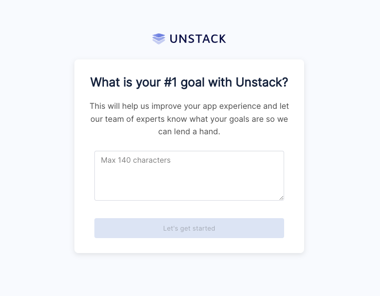
Product research pop up
As part of our ongoing efforts to understand the reasons our users sign up for Unstack in the first place, we have added a popup question that appears when you first install the Shopify app
Capitalization and letter-spacing
If you're a user who likes the text of their headers or buttons to always be capitalized, lowercase, or mixed case you are in luck! With this release we shipped changes to the Style Guide which allows you to make those changes at the account level.
Product Collection Component Changes
Using component properties, we added several layout options to the "Product Collection" component. Specifically the ability
DDC Import & Export
Data Driven Content, or DDC is a beta feature that we're very proud of. However, as a beta feature there is a lot of work that still needs to get done. The release of the import & export feature is one of those things that has been in the works for some time and is a huge milestone for this tool.
Look for more on DDC soon!
Major You can now increment and decrement the prices of your child products. See Modifiers Overview.
Major
You can now use include=component_products to get more information about the products in a product bundle. See Includes.
Minor Removed the store owner role from Commerce Manager. A store owner was a permanent seller admin in each store. You can now remove or change the role of former store owners. Functional and feature access for former store owners have not changed.
For this release, we continued to work through changes to the component system which will allow us to further improve functionality. More on this soon! We also pushed a number of bug fixes.
Minor Removed the Store ID field from the Commerce Manager home page. The Store UUID field has been renamed to Store ID. Use this value to open a support ticket.
We shipped some pretty significant changes to the component system that will enable future functionality. More on that soon! We also fixed one bug.
Minor
Added purchase as an option to support Manual Payments. For more information, see Manual Payments.
Minor Files Service Refactor:
Major
Hierarchy Node Sorting: You can now specify sort order for child nodes within a hierarchy. The default sort order is in the descending order of the updated_at time, see Create a hierarchy node.
Major Commerce Manager: You can now use Product Bundles in Commerce Manager.
Major Commerce Manager: You can now cancel an unfulfilled order in Commerce Manager. For more information, see the Cancelling an Order section.
A small release with a handful of bug fixes and tweaks. Several new features in the works including Component Properties which is a set of changes to the section/component experience which will help to reduce redundancies with our current component experience. More on this when it's released in the coming weeks.
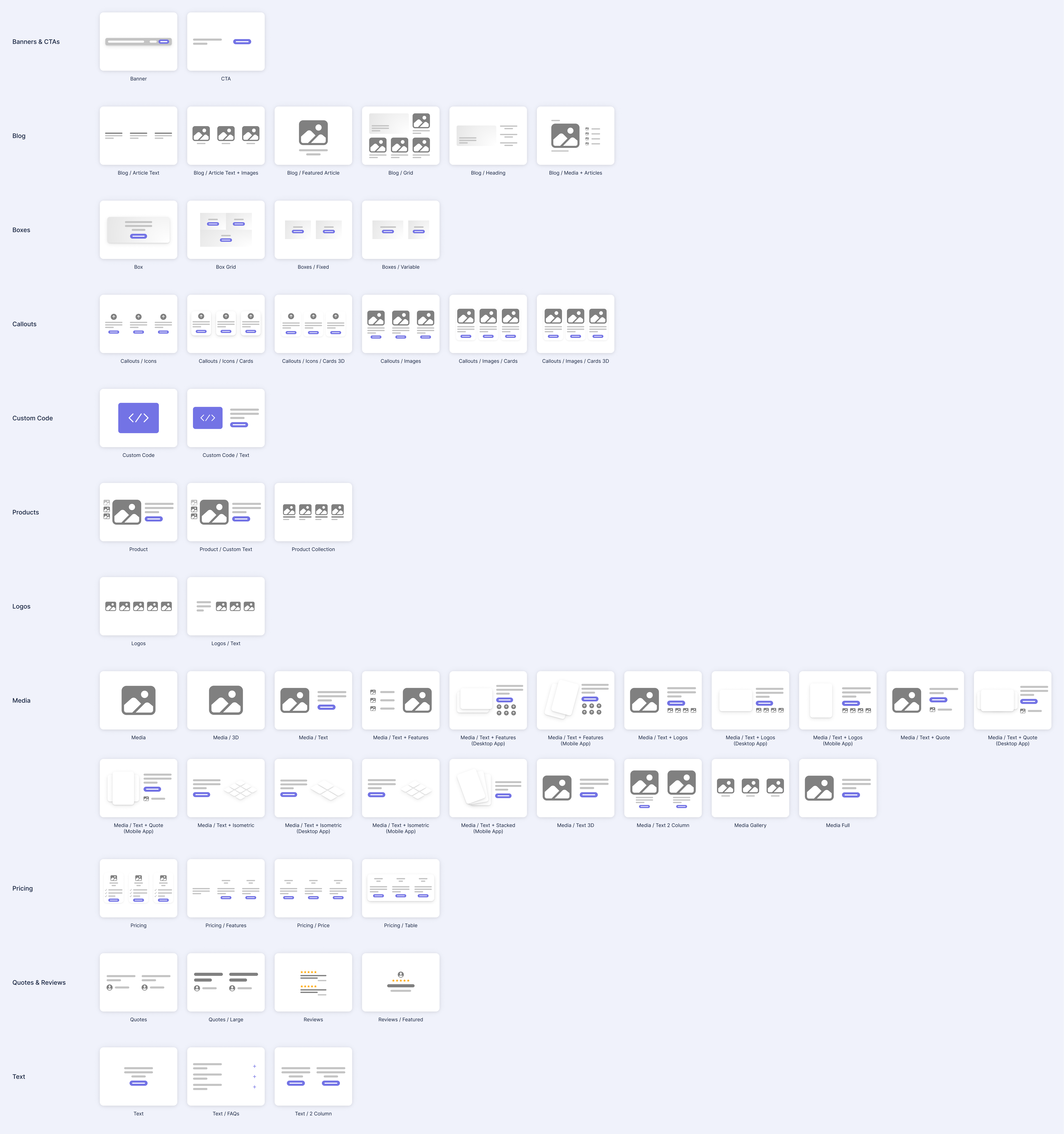
Recategorized Components
We spent some time reorganizing renaming components to make it easier to find what you are looking for in the component selector. We also added thumbnails for some of the components that didn’t have them. There is more work to come on this to make it even better, but it’s already easier to find some things.
Template Updates
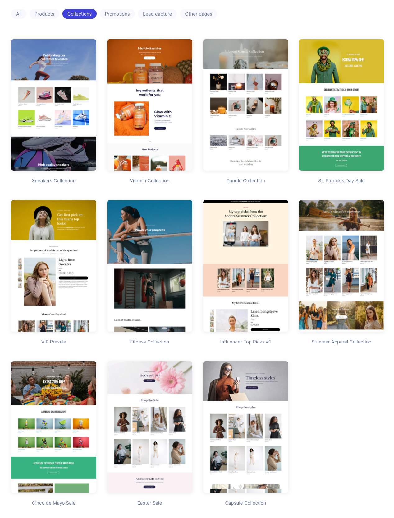
We rolled out an update to allow our backend teams to more-easily launch the templates that they've been working on. This includes changes to way we generate screenshots of these templates as well as the way that we add them to accounts.
Major You can now integrate Elastic Path Commerce Cloud with your other company systems using message queuing services that support the Message Simple Text Orientated Messaging Protocol (STOMP), for example, Amazon MQ. See Integrations.
Minor Added cancelled state to the order status. You can now update the status of an unfulfilled order to cancelled. For more information, see the Cancel an Order by ID section.
A tiny release with a few fixes and tweaks.
Polish on product list items
We squared up the product and collection thumbnails to better accommodate stores that aren’t using portrait images ( landscape or square).
We also improved the hover effects and made some other subtle style tweaks. This impacts the product selection drawers and the index pages for products and collections.
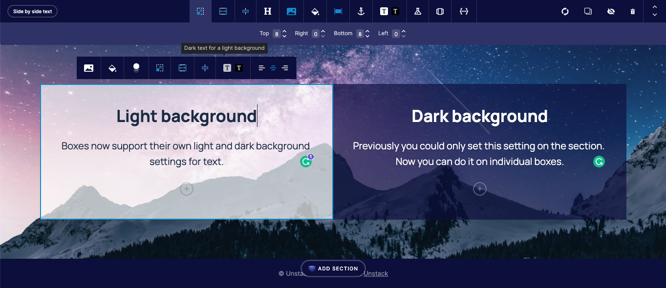
Dark and light text toggle on boxes
Boxes now support their own light and dark background settings for text. Previously you could only set this setting on the section. Now you can do it on individual boxes.
Both sections and individual boxes have this setting. If it’s not set on a specific box, the box will inherit the setting from the section.
Bug Fix Commerce Manager: Fixed a bug where users got an authentication loop after a failed authentication.
Minor Commerce Manager: Users can now filter the accounts list by account name in Account Management.
Bug Fix Commerce Manager: Fixed a bug where an image uploader breaks when user attempts to type in a URL.
Minor Commerce Manager: Added cart expiration in settings.
A smaller release, but we shipped a few features and tweaks in addition to a number of bug fixes. Tons of work on some new features and editor improvements that will both land in a future release.
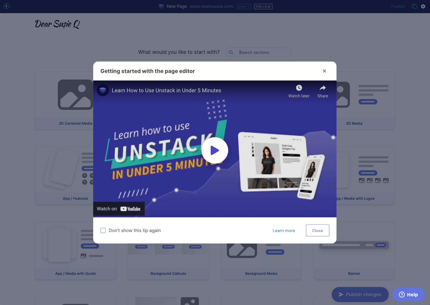
Intro video for the page editor
As part of our work to improve the onboarding experience, a popup intro video for the editor will appear the first five times you enter the editor. You can also dismiss the tip permanently if you choose to.
Product images for all media
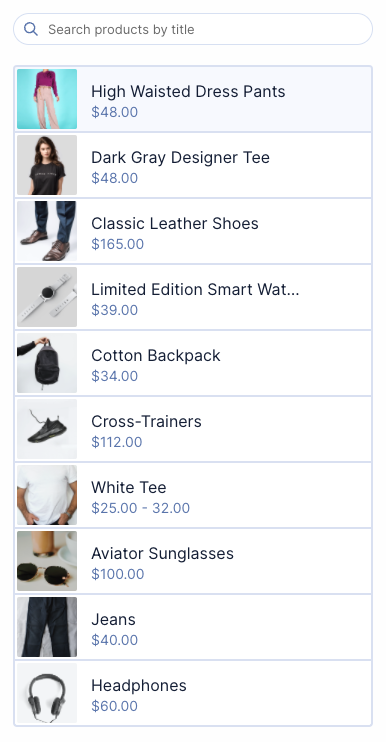
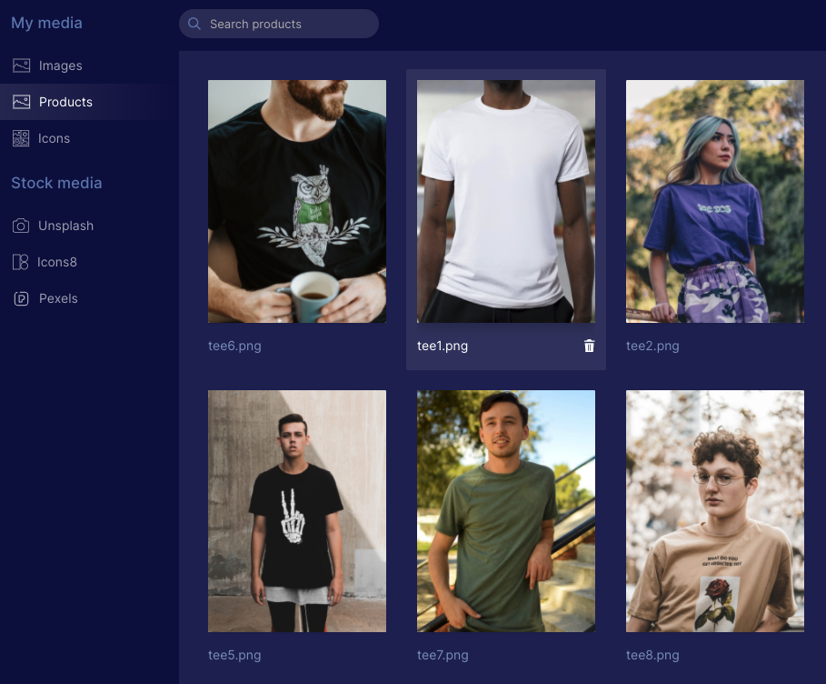
There’s a new folder in the media manager for Products where images that are imported from Shopify products will appear. This will make it easier to use product images in any Studio component.
Domain settings for Shopify
We cleaned up the domain settings for Shopify customers using the App Proxy functionality to load CX-Studio pages on their Shopify domain. When you’re using App Proxy it now shows “Point to Shopify” and you aren’t able to change it (we will probably enable people to change this in the future).

Form Width
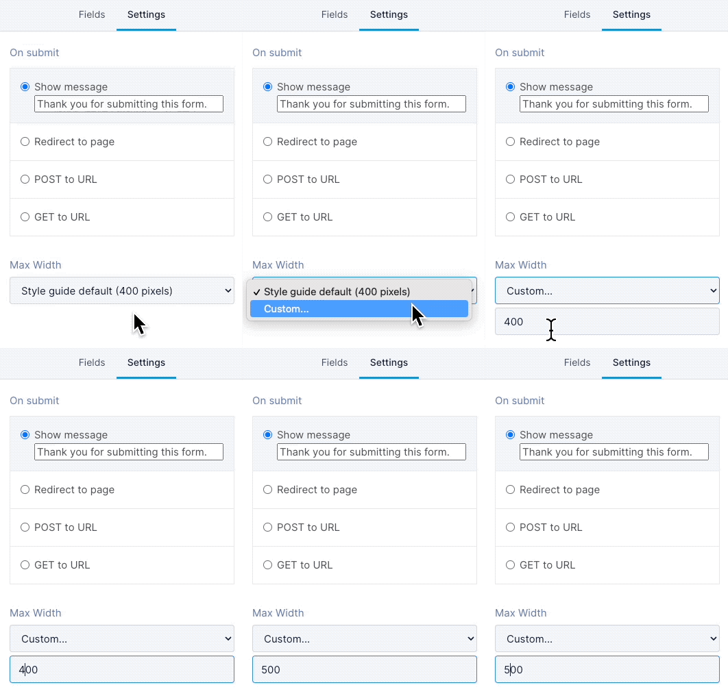
In this release, we rolled out changes so that you can set a custom width for a form. All forms will use the style guide setting by default, but you can now set a custom width:
In the admin portal, under Forms, open the form you want to change
Click on the Settings tab
Under Max Width, select Custom...
Enter a number and save!
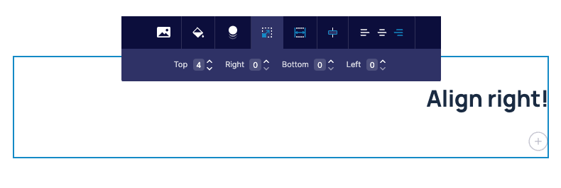
Text-align Right
You can now align text to the right! This is something we probably should have done a long time ago, but we’re only now getting to it along with a number of other editor improvements.
Minor Account Management APIs are no longer in beta. You can now remove account-management and account-authentication-settings from the Beta Header and use the APIs in production environment. For more information, see Account Management.
Another large release shipping a few key features and a ton of small fixes.
Shopify Free Plan
We’re now putting all new Shopify accounts on a free plan. This is a temporary change until we introduce multiple Shopify plans in Q2 of 2022.
Collapsing Product Descriptions
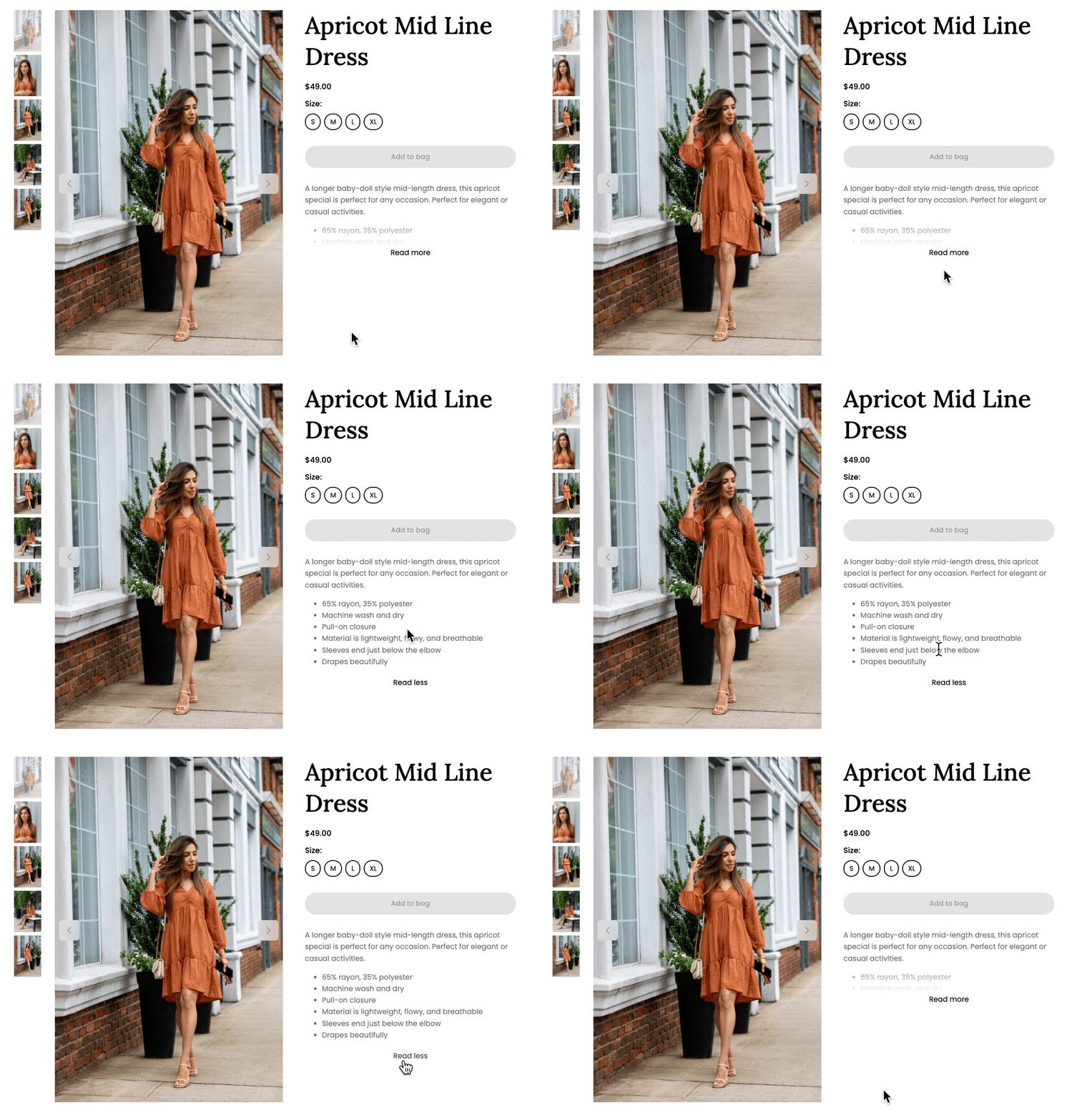
Stores often pack product descriptions with content that’s valuable for SEO. When rendered inside of our product component that text spills down the page creating an odd unbalanced view.
In this release, we rolled out a change that hides the text behind a “Read more” link if it is longer than 5 lines.
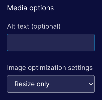
Resize-only for media
We’ve had a number of issues with image optimization being too aggressive so we’ve changed the default when adding media to Resize only.
Deleting users & accounts
We added functionality for our internal teams to be able to permanently delete users and accounts from our database. In the past we haven't had a good way of handling this and previous requests took longer to resolve than we'd like.
JSX Rendering Backend
We shipped the next phase of the prep work needed to support Component Properties. When we rolled out refactor NoML to be more like JSX we added a translation layer to translate from the new syntax into the old. This allowed us to use to avoid rewriting the rendering layer. In this release we rewrote the rendering layer so it’s no longer using the old syntax.
Major Commerce Manager: You can now view promotion history in Commerce Manager.
Minor Commerce Manager: You can now select usage limit type and maximum uses when bulk generating promotion codes.
Minor Commerce Manager: You can now use pagination to navigate through store list when you have more than 50 stores.
Minor Commerce Manager: Improved authentication error message for invalid credentials.
Minor Commerce Manager: Updated the warning message that appears when you try to update an attribute after deleting the template associated with the attribute.
Minor Commerce Manager: You can now paginate through inventory management log.
Another monster release for the engineering team packed with features, tweaks, and bug fixes! This work was delayed for a few weeks while we tested the new JSX syntax for NoML. As a consequence more issues were rolled into this release because it includes work from the past three weeks.
Showing a variant featured image
Shopify allows users to associate a single image with each variant. In this release, we added functionality to the product component that selects the variant image when the appropriate options are selected. This will zip to an image of the shirt in red when the red color is selected.
Banner Components
A reoccurring feature request, we implemented a basic banner component. That might sound kind of silly, but to date, we didn’t have a good way to build a component that had smaller buttons and padding. It’s now trivial to add a banner to any page.

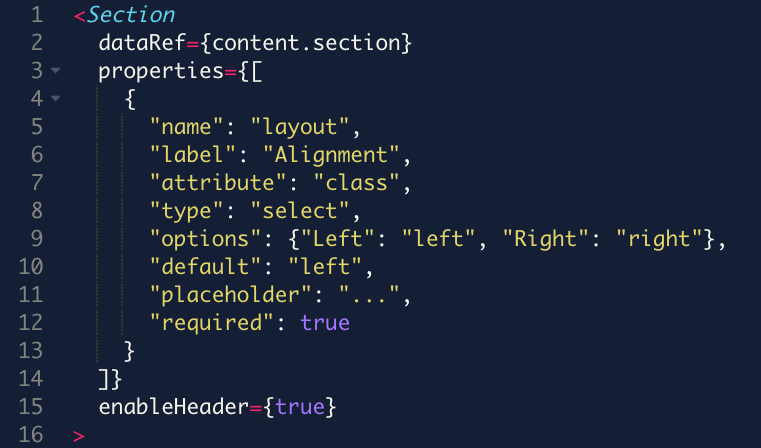
JSX-Style Components
We’ve reworked the syntax of NoML to align with React’s JSX syntax. This is one of the things we needed to push out to make it easier for us to iterate on components, allows us to render dynamic changes within the section editor, and is a syntax that is familiar to a lot of developers.
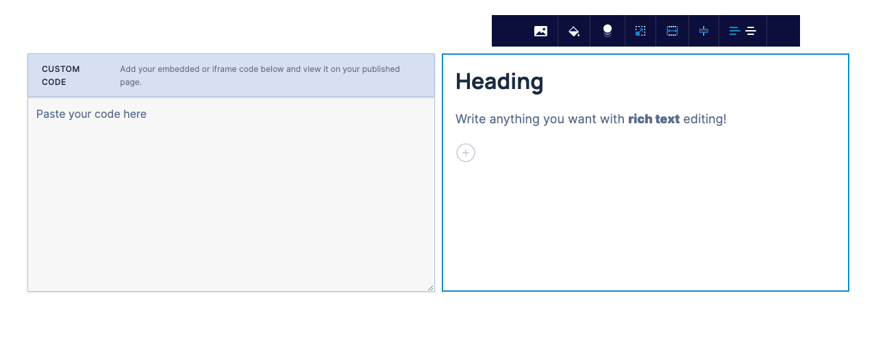
Custom Code with Text Component
This behaves a lot like the Media component, but instead of an image you can add custom code. This will make it much easier to add custom embeds (for example a map) with text on the left or right.
 ]
]
Following the end of the holiday season we shipped a number of quality of life improvements for components and a handful of other changes.
Better reviews ⭐⭐⭐⭐⭐
Our reviews component has been revamped to include better layout support as well as properties for toggling stars, avatars, and taglines.
Animated logos & more!
Our standard logos component has been updated with support for animated scrolling! We also added support for grayscale, black & white, or reversed filtering.
Content subscriptions are no more
While this is a valuable feature for people who want to require a subscription in order to access content, Stripe deprecated their payment forms entirely and is now telling users to use payment links to achieve the same functionality. We were faced with updating our code to use payment links instead of forms (which was costly) or phasing out the feature. As this is not a widely used feature we chose the latter.
Meta description is now optional!
Previously we required that users add a meta description to their page before we let them publish that page. This is no longer the case. While it can be important for SEO, people often bypass this requirement with dummy content. This is actually worse for SEO. And if you don’t need to worry about SEO for your use case it makes no sense to require it. Given this, we decided the best thing was just to make it an optional field.
Minor You can now view and replicate previous orders.
Minor Global table updates for expanded and compact row views.
We had a monster release with a number of small, but significant features added to the product and a ton of bug fixes.
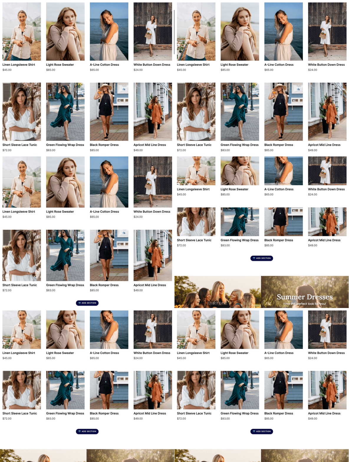
Better product collection component
We just rolled out a new version of the product collection component. Not only does it look amazing compared to the old version it also allows you to automatically crop collection photos to a Portrait, Landscape, or Square aspect ratio.
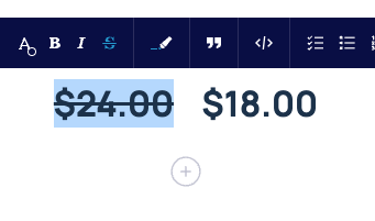
Hello strike-through!
A reoccurring feature request, we finally had a chance to add a strikethrough button to the rich text editor. The needs of eCommerce customers made this a low-effort high-reward feature addition. Now customers can use strike-through to show price comparisons.
Better organization of templates
We now have more control over how templates are organized on the choose a template screen. New categories exist for Products, Collections, Lead Capture, and Other pages.
New eCommerce templates
Also new as of last week, we’ve added two additional landing page templates. Our first collection page template and a template that helps to demo our personalization features.
Much more to come on this front.

Better sync for product changes from Shopify
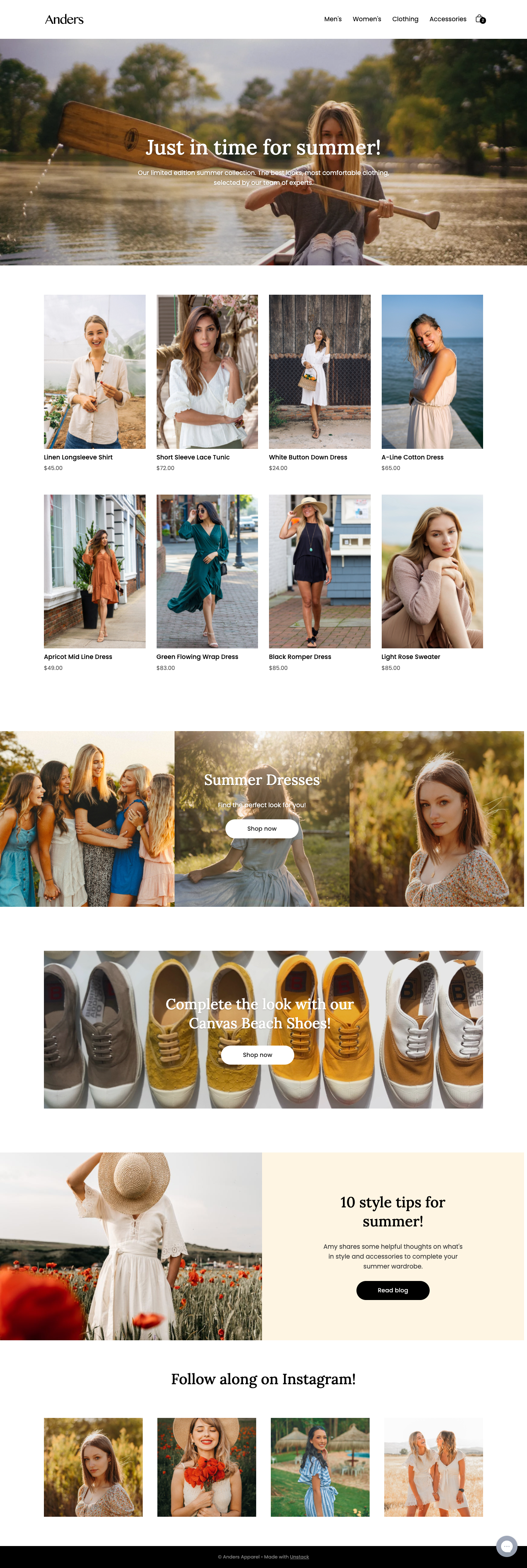
This won’t be fully realized until future releases, but we shipped the first work that will enable us to sync product changes on the fly from Shopify. Sync will soon occur whenever a change is made to a product and you won’t need to start the sync job manually any more.
Launch of Conditional Content! We updated the new page flow to better support product pages. We also shipped a ton of bug fixes in this release and disabled Semrush.
Conditional Content for Personalization
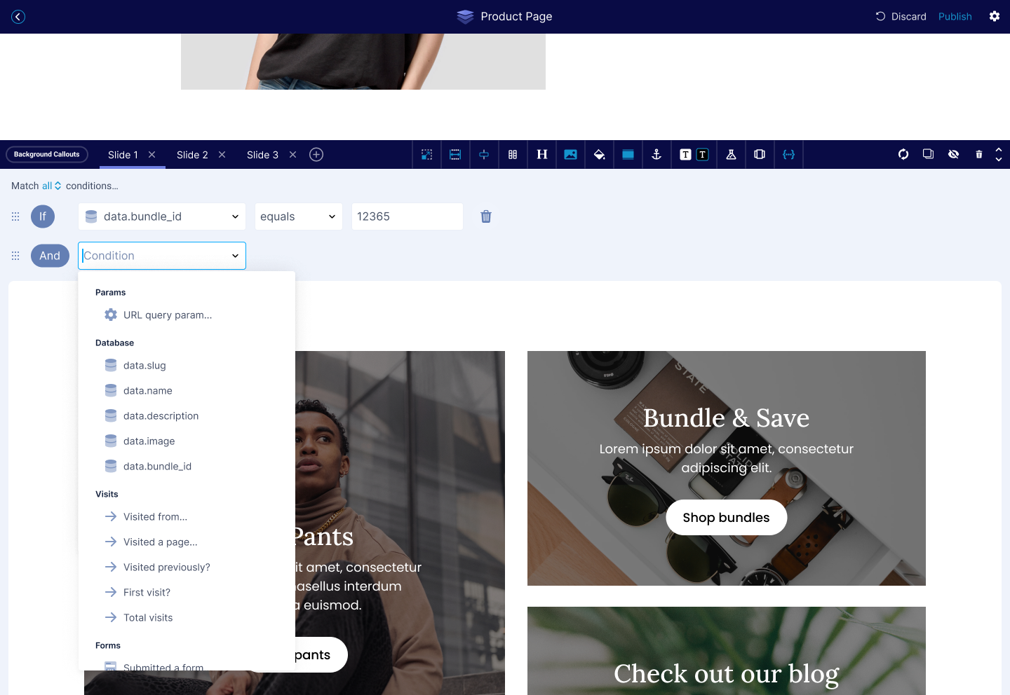
Rounding out Conditional Content we’ve extended the functionality to support contact properties and behavior (in addition to the previous work for DDC).
This work makes it possible to support a bunch of additional use cases that are especially important to eCommerce customers who want to build personalized content for users. For instance, it’s now possible to show different content on a page for repeat visitors.
Updates to product selection flow
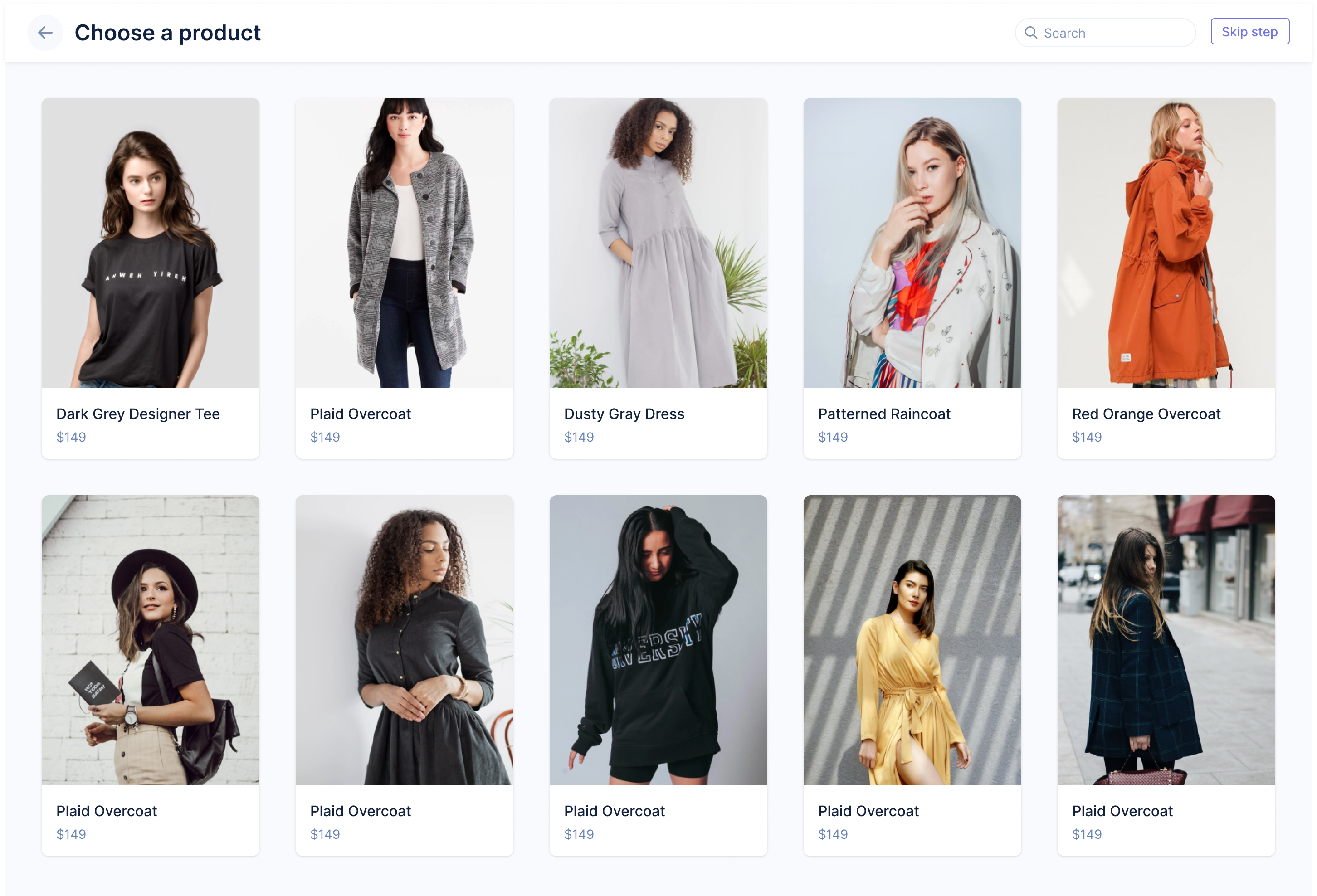
We’ve streamlined the process of adding a product to a page template by building it into the landing page flow. Previously, you would be dumped straight into the editor after selecting a product page template. Now you’ll be asked to select a product. As we continue to invest in improving our onboarding experience for Shopify customers you’ll see us ship more features like this.
So long, Semrush!
Our Semrush integration stopped working recently. As we were evaluating the work required to get it working again we decided to disable the integration for now because it is not used that much in the eCommerce space.
We may re-enable this in the future if there is the right kind of demand, but for now, so long, Semrush.
This was a smaller release with mostly bug fixes and some prep work on features that will be released in January.
Minor You can now use includes to view main images and files of products in catalog view.
A simple release. A handful of fixes, and a couple new features.
Gorgias Chat Integration
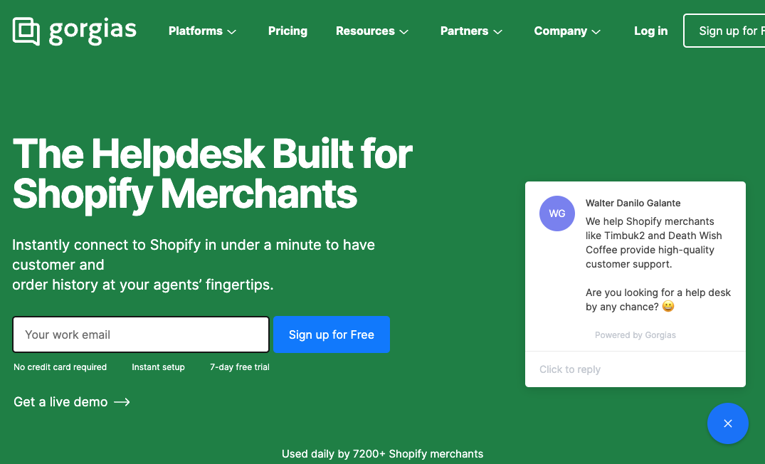
More common with eCommerce customers Gorgias (pronounced Gorgeous) is a helpdesk solution for storefronts.
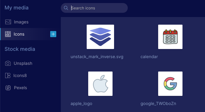
Icons & Images
We've tweaked the media manager so that you can now select any image or icon for any media component.
Now when you are selecting an icon the media manager will open on the "Icons" tab, but you will also be able to select " Images" to pick an icon instead.
The same is true for media which defaults to the "Images" tab but allows you to select "Icons".
